Feeling in photography
- Aug 27, 2016
- 3 min read
Not only photography can capture a moment but it can also capture feelings. Feeling in photography is the feeling that you can observe or feel when you see a photograph. They could be a sadness that you see in people’s eyes or it could be a loneliness from a nice silhouette sunset picture. Whenever we see a photograph, we automatically feel something even sometimes it can’t be described. For some photos, the feeling is very vivid, and that has something to do with the process of getting that individual picture. In this article, you will learn two of my processes in photography that I use to achieve those feelings.
How composition evoke feelings ?
The composition is the placement of objects or elements in a work of art (photographs). It is basically how you place your elements in a particular spot within a frame. By placing subjects in different spot or point of views, it could definitely evoke different feelings.
Negative and Positive space
Positive space is an object that is in focus and negative space is space around it. For example, positive space in this picture is a plane and negative space is the sky around it.
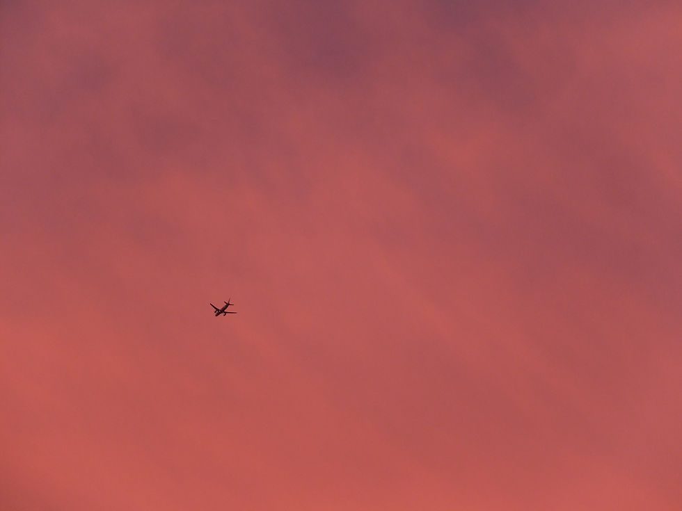
In this case, the ratio of negative space is more than positive space, therefore the focus will be on the plane. As a result, the plane in this picture seems solitude which we can feel a loneliness from it.
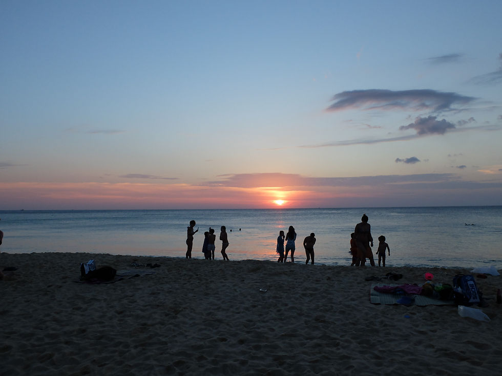
Horizontal and Vertical line. A picture with horizontal line evokes the feeling of calm and peaceful while vertical indicate an alert.
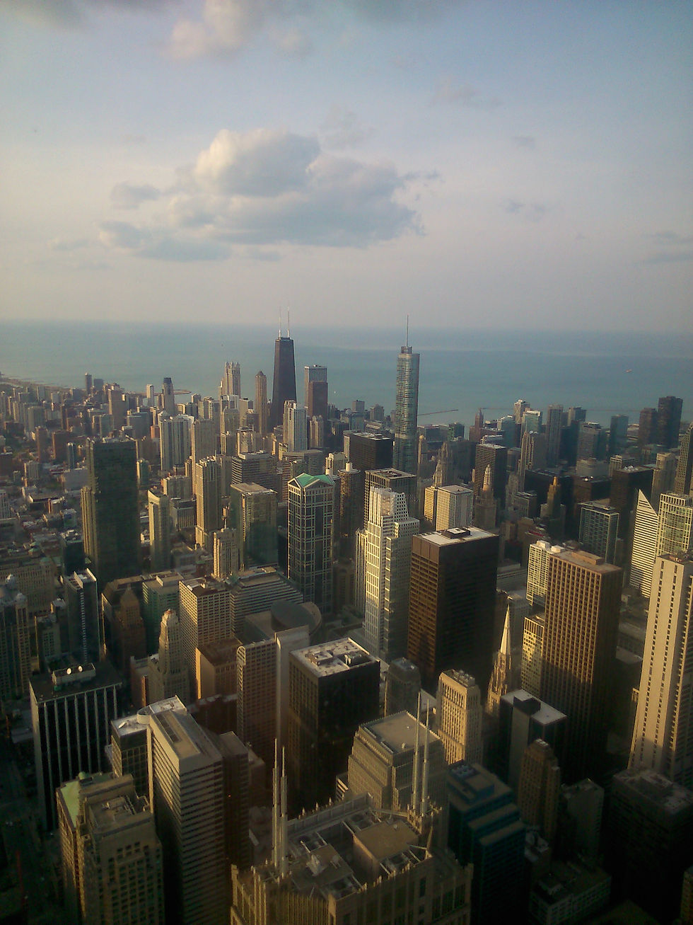
Top down and bottom up angle A subject that is taken from the top angle seem weak, small and vulnerable but on the other hand, from the bottom up angle, subject will look powerful and intimidating.
How colors evoke feeling ?
To make this easy to understand I'll make lists of colors and their meanings.
Red - Energy, war, power, danger, strength, determination, passion, passion, desire, and love Orange - Joy, sunshine, tropical, and sophistication Yellow - Joy, happiness, intellect and energy Green - Growth, harmony, and freshness Blue - Depth, stability, trust confidence, and truth Purple - Royalty, power , luxury and ambition Gray - Neutral, timeless, and practical Brown - Reliability, Stability, and friendship White - Innocence, cleanliness, and purity Black - Power, strength, authority, and death
So how do we use those color ?
The answer is just to simply dominate your desired color in a picture. In another word, to make that color cover a higher ratio than another color in a frame. However, you can use a specific color to create feeling and focus point on an individual object by adding your desired color on them. The process of creating feelings in photography by using color is not just about choosing and object to shoot base on its color. But it is related to clothing, makeup and post-processing (editing) too. For example, some of the pictures below have a very unnatural color as a result of editing.
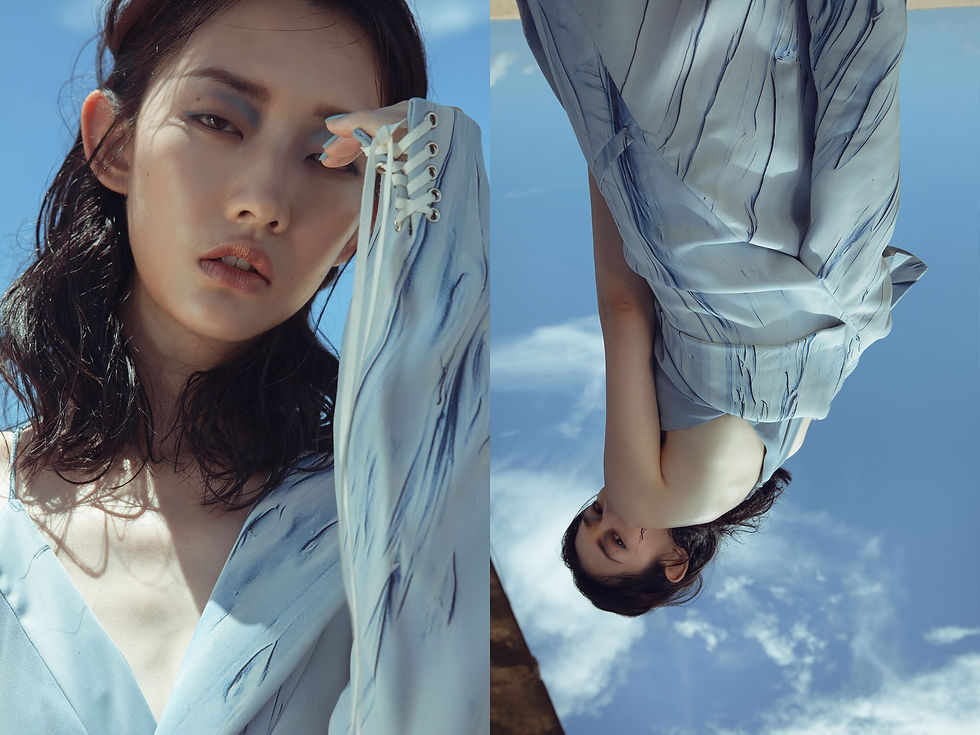
Photo / Kadosa yuan Model / Jessica KuoStyling / Ball Ball ChiuHair / 韋冠宇Make-up /莊風箏Designers / 詹紅紅
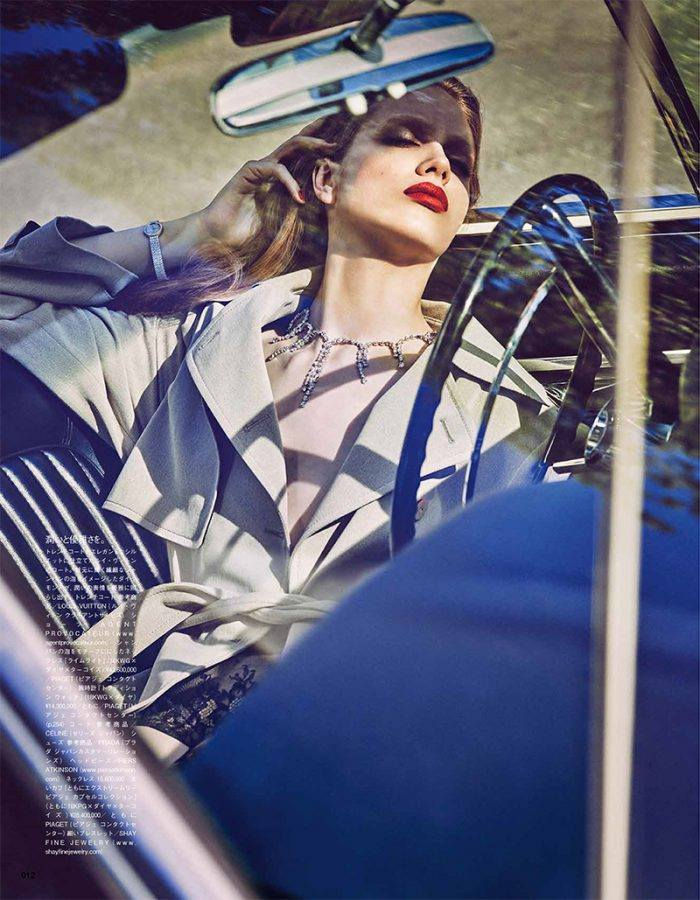
Credits include: Publication, Vogue Japan September 2016; Title, “Driving Miss Odette”; Photography, Luigi & Iango; Styling, Anna Dello Russo; Hair, Luigi Murenu; Makeup, Georgi Sandev at Streeters using NARS Cosmetics; Manicure, Elena Stepaniouk at Face to Face Agency; Casting, Piergiorgio Del Moro for DM Casting at Exposure NY; Production, Vinnie Liazza; Styling assistance, Carlotta Oddi, Chiara Totire, Virginia Cuscito, Carlotta Tabaroni, Ginevra Lavinia.


Comments